Timeline
2023
My Role
UX/UI Designer
Overview
The Election report website project aims to create a comprehensive, accessible, and engaging online platform that serves as a central source of information during Thai elections. It focuses on delivering real-time election results, in-depth candidate profiles, and crucial issue discussions, catering to the needs of voters, journalists, and political analysts. The project encompasses thorough research, responsive design, visually appealing data visualizations, and seamless user experience to promote transparency, civic engagement, and informed decision-making throughout the electoral process.
Objective
To design and develop an intuitive and user-friendly Thai Election report website that presents accurate, real-time election data and information, allowing voters, journalists, and political analysts to easily access and understand election results, candidate profiles, and key issues, ultimately promoting transparency, civic engagement, and informed decision-making during the electoral process.
And another goal is to make it the No.1 election website in Thailand, creating a trend with a lot of shares.
Research & Analysis
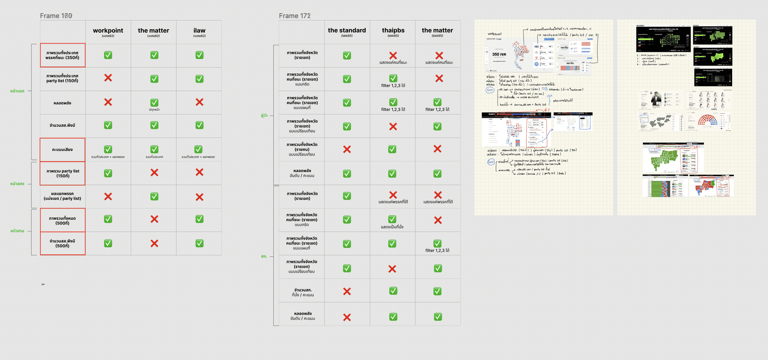
The Standard provided the team with a broad scope, which required the team to hone their ideas more precisely. The team conducted research on past election websites, both domestically and internationally, and brainstormed to find the direction of this election website. We deliberated on what approaches to take and how we could differentiate ourselves from other websites in order to achieve our goal of becoming the number one website. For instance, one of the conclusions from our discussions was that we agreed to design the Election 66 website to look highly competitive and exciting, with a sense of realism. We decided not to use a cartoonish design.

Wireframing
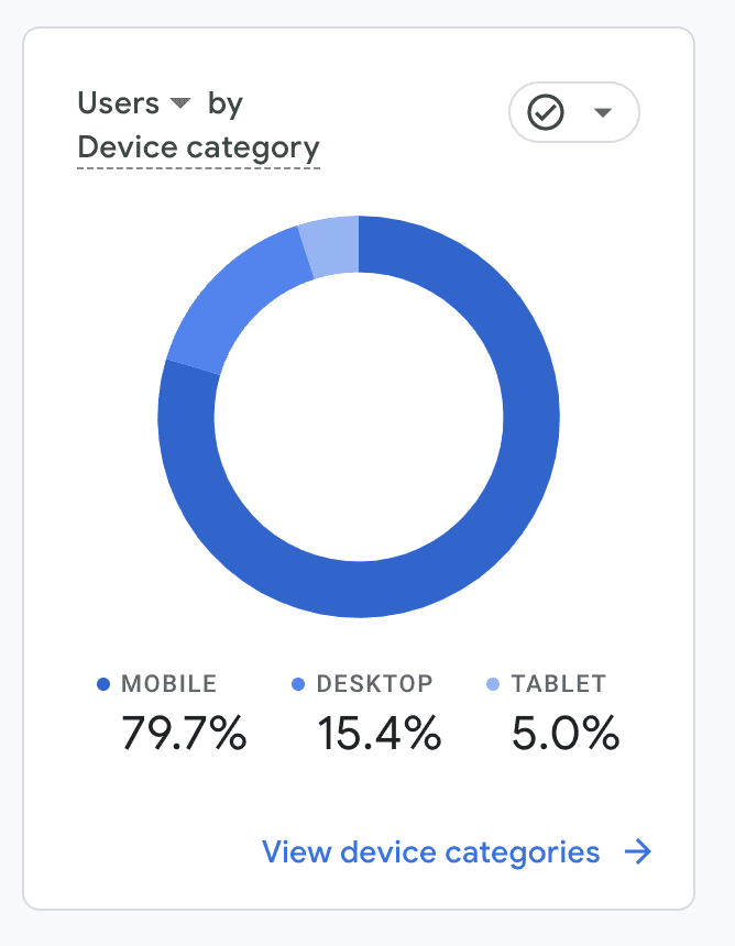
During the design or wireframe stage, my team and I focused on a mobile-first design, prioritizing the user experience on mobile devices due to various factors. For instance, our target audience was teenagers, and given the context of their usage during that time, we believed that users would primarily access the website via their mobile devices.
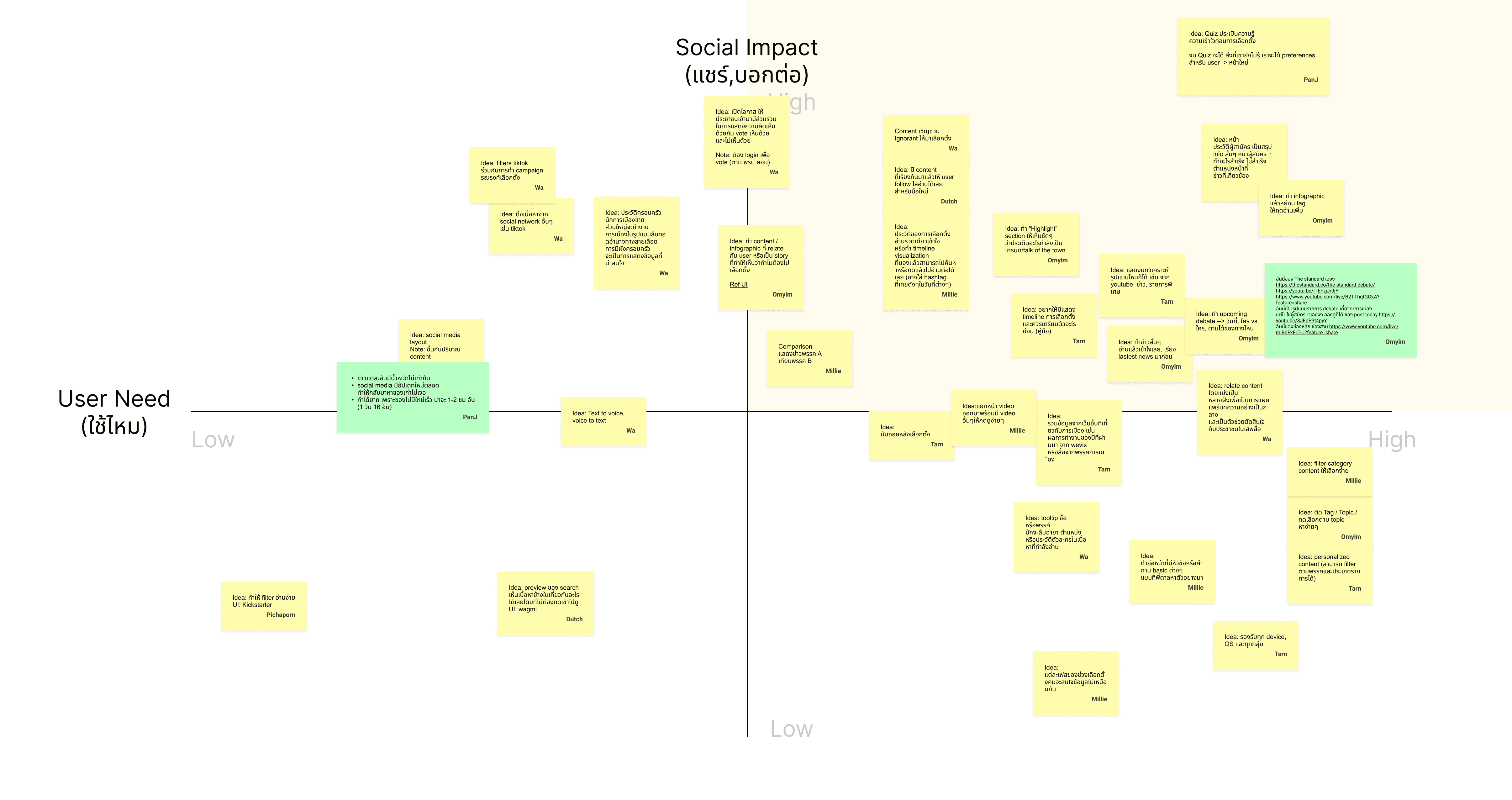
The wireframe was built upon the research we had conducted. Our design team concentrated on laying out the interface and evolving it into a UI that would generate excitement and a sense of competition. At this stage, we planned to design closely with the users, aiming to test with them as quickly as possible, make rapid adjustments, and repeat this loop frequently.
After creating the wireframe, we designed a rough version of the UI and visuals to test with users. We wanted to determine whether our designs communicated what we intended and whether they aroused excitement and a desire to share among users. We also conducted usability tests concerning the layout and various types of information.
UI Design
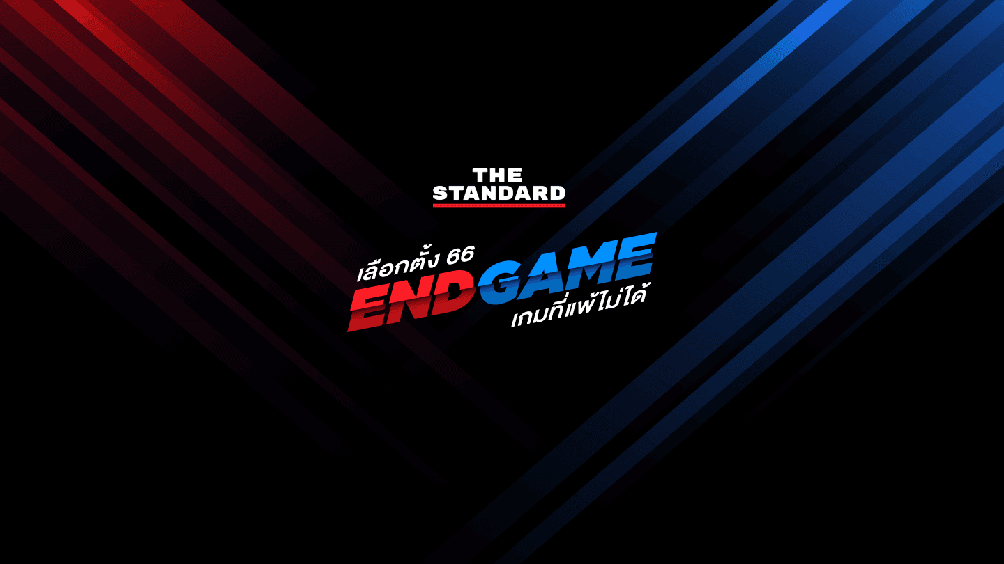
After my team and I tested the rough visual designs, we received feedback and clearer directions. The UI and various visual designs I was working on related to The Standard's theme for this election: "End Game, เกมที่แพ้ไม่ได้" Our team received basic assets from The Standard, such as candidate photos or the CI Guideline for this year's theme. However, because of the ideas that my team and I had discussed, we had to design several additional assets to make the website more exciting, competitive, and shareable.
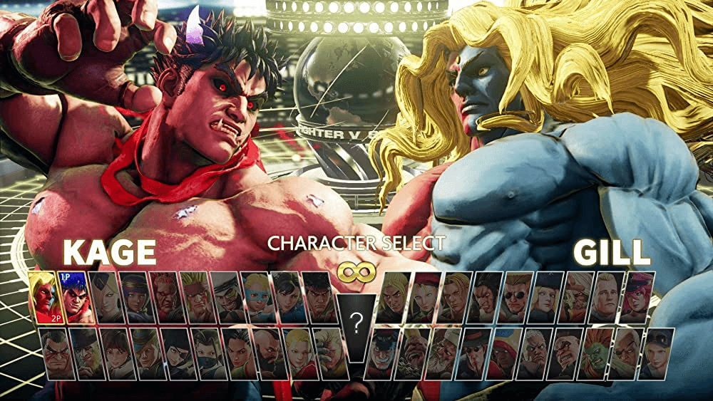
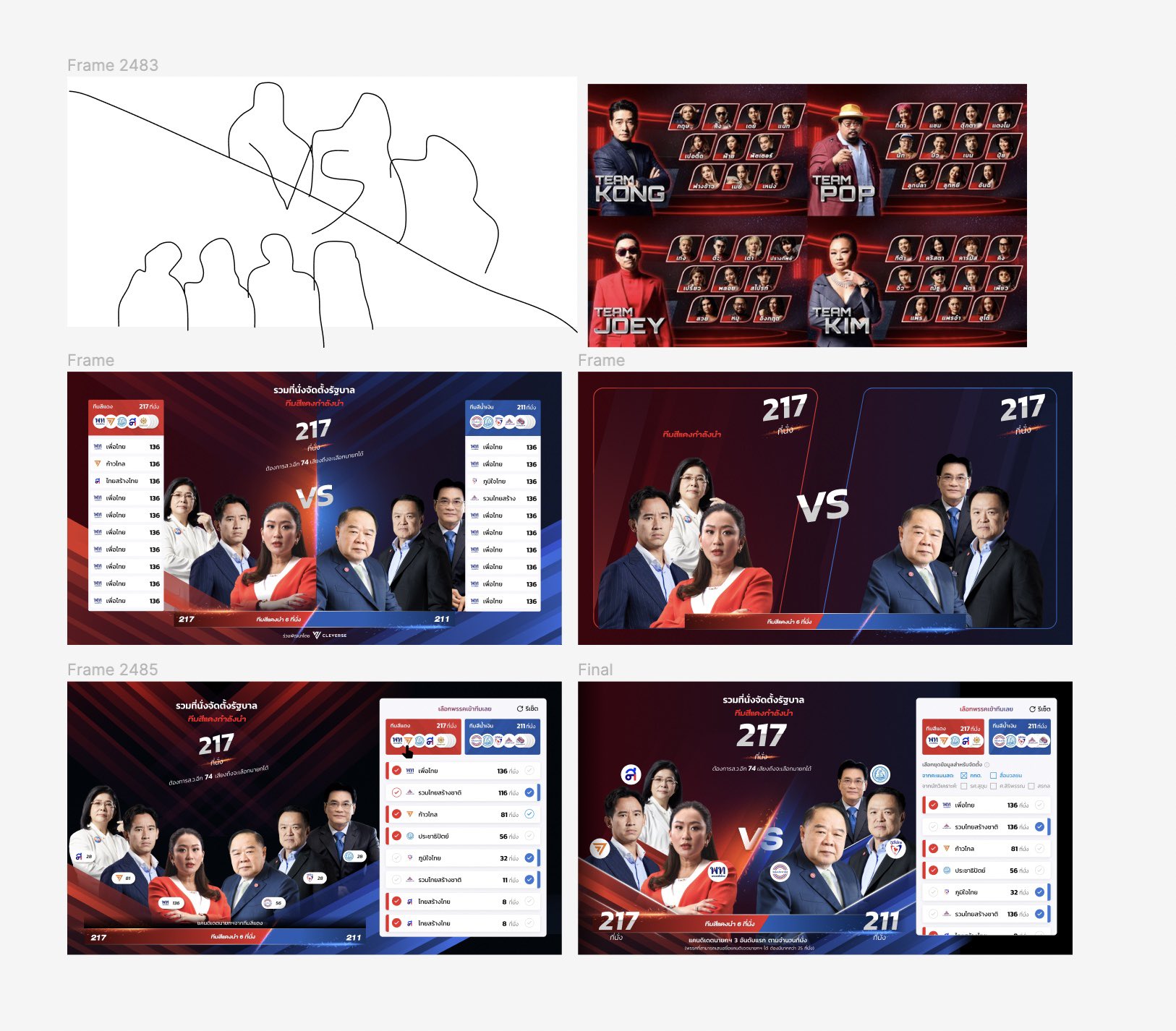
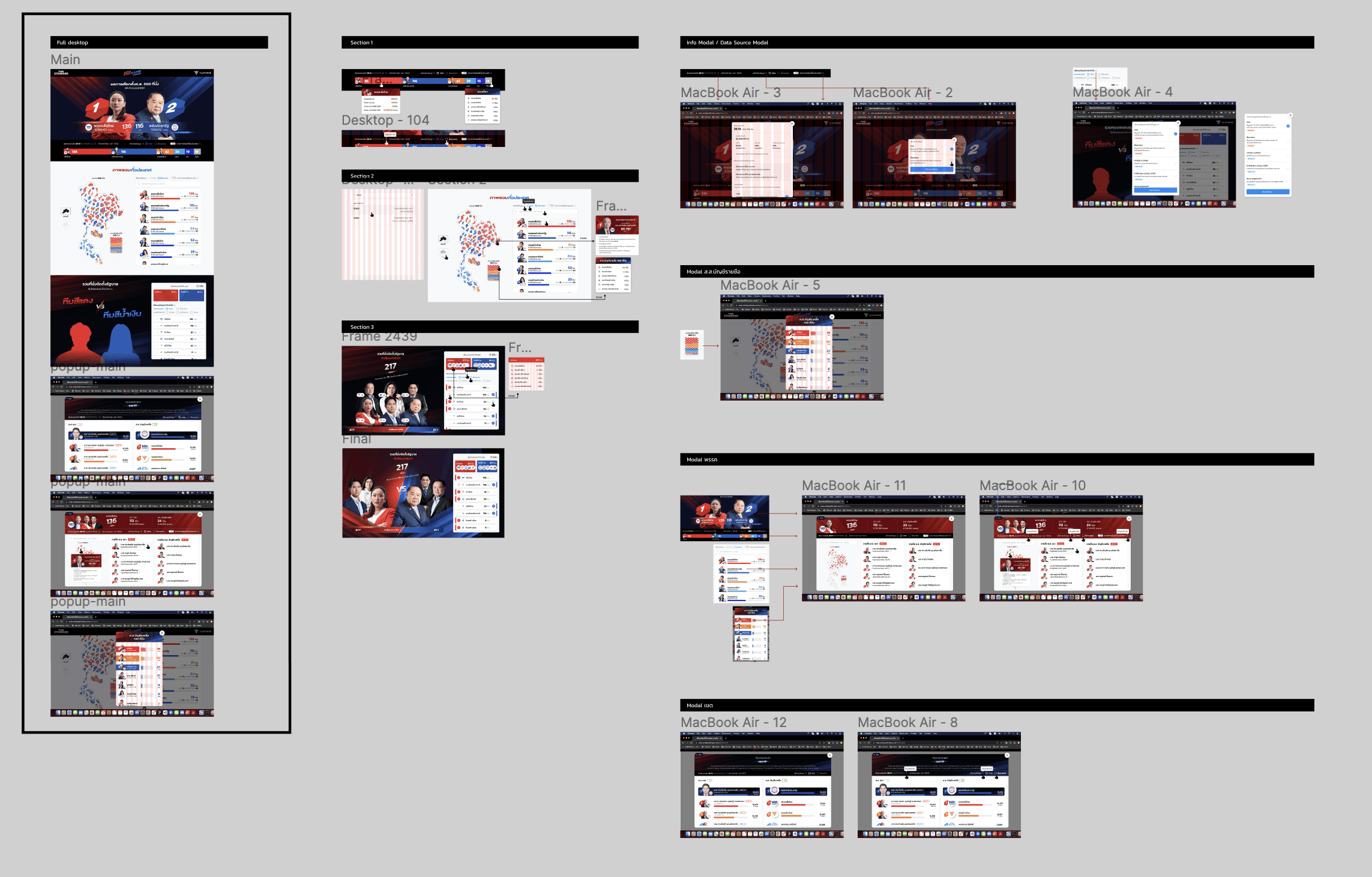
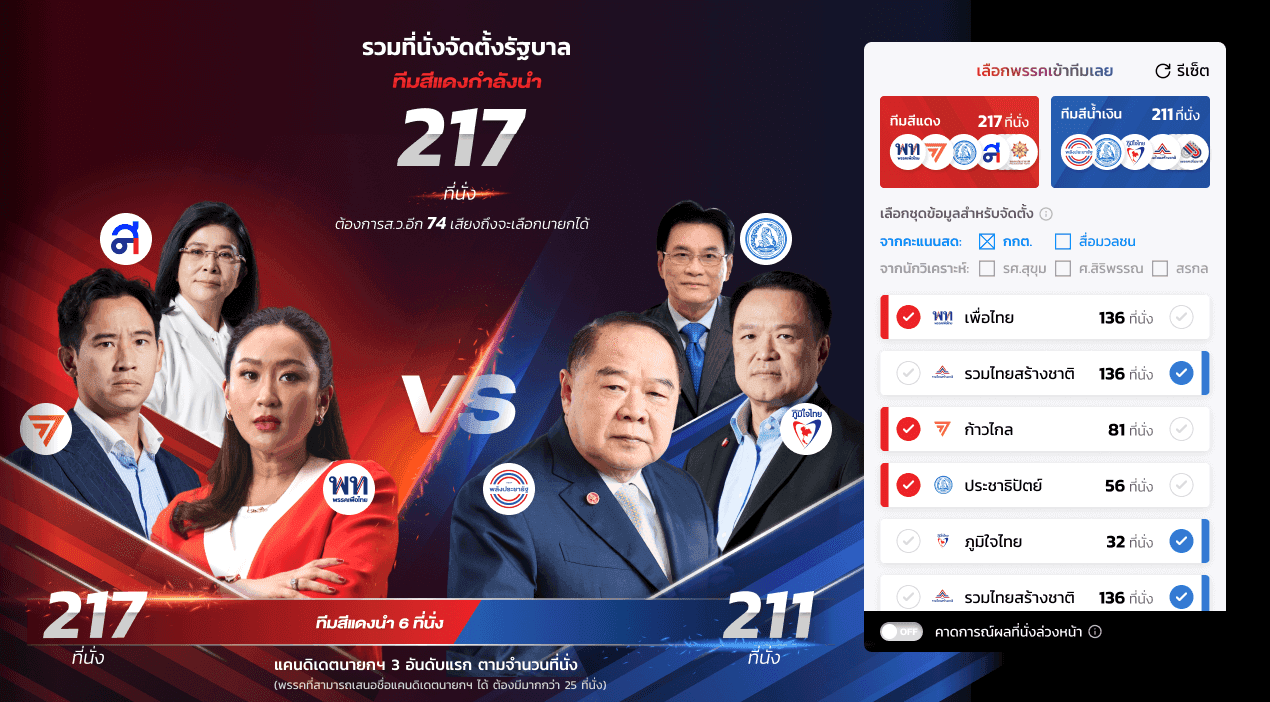
The main focus of this election website project was on the dynamism of the design and visuals. This stage took us longer than others because I had to organize the assets for easy hand-off to the developers. As an example, I designed the "Government Simulation" section to look like a competition, dividing the teams into two sides to give it an atmosphere reminiscent of old fighting games. I drew inspiration from Street Fighter and The Voice Battle.
Result & Impact
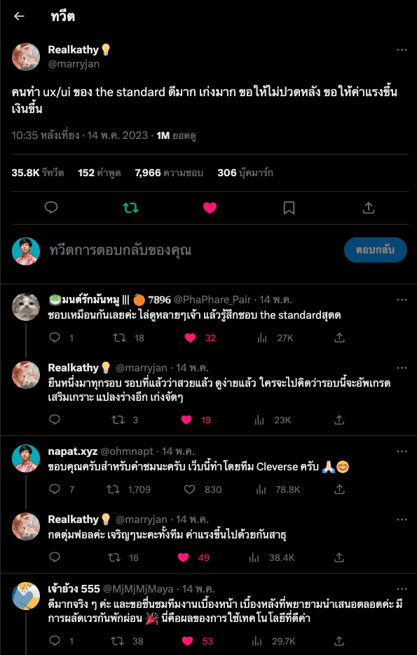
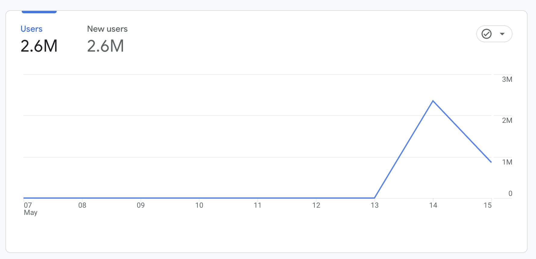
The website had more than 2.6 million users (only those who allowed cookies are included in this number), and over 8 million people came to watch the live broadcast. The project was widely discussed on social media, in line with the ambitious goals we had set. The website was extensively shared, and we received a great deal of positive feedback on the design. This resulted in the project not only achieving its goals but also exceeding our initial expectations.


Timeline
2023
My Role
UX/UI Designer

Overview
The Election report website project aims to create a comprehensive, accessible, and engaging online platform that serves as a central source of information during Thai elections. It focuses on delivering real-time election results, in-depth candidate profiles, and crucial issue discussions, catering to the needs of voters, journalists, and political analysts. The project encompasses thorough research, responsive design, visually appealing data visualizations, and seamless user experience to promote transparency, civic engagement, and informed decision-making throughout the electoral process.
Objective
To design and develop an intuitive and user-friendly Thai Election report website that presents accurate, real-time election data and information, allowing voters, journalists, and political analysts to easily access and understand election results, candidate profiles, and key issues, ultimately promoting transparency, civic engagement, and informed decision-making during the electoral process.
And another goal is to make it the No.1 election website in Thailand, creating a trend with a lot of shares.
Research & Analysis
The Standard provided the team with a broad scope, which required the team to hone their ideas more precisely. The team conducted research on past election websites, both domestically and internationally, and brainstormed to find the direction of this election website. We deliberated on what approaches to take and how we could differentiate ourselves from other websites in order to achieve our goal of becoming the number one website. For instance, one of the conclusions from our discussions was that we agreed to design the Election 66 website to look highly competitive and exciting, with a sense of realism. We decided not to use a cartoonish design.

Wireframing
During the design or wireframe stage, my team and I focused on a mobile-first design, prioritizing the user experience on mobile devices due to various factors. For instance, our target audience was teenagers, and given the context of their usage during that time, we believed that users would primarily access the website via their mobile devices.
The wireframe was built upon the research we had conducted. Our design team concentrated on laying out the interface and evolving it into a UI that would generate excitement and a sense of competition. At this stage, we planned to design closely with the users, aiming to test with them as quickly as possible, make rapid adjustments, and repeat this loop frequently.
After creating the wireframe, we designed a rough version of the UI and visuals to test with users. We wanted to determine whether our designs communicated what we intended and whether they aroused excitement and a desire to share among users. We also conducted usability tests concerning the layout and various types of information.


UI Design
After my team and I tested the rough visual designs, we received feedback and clearer directions. The UI and various visual designs I was working on related to The Standard's theme for this election: "End Game, เกมที่แพ้ไม่ได้" Our team received basic assets from The Standard, such as candidate photos or the CI Guideline for this year's theme. However, because of the ideas that my team and I had discussed, we had to design several additional assets to make the website more exciting, competitive, and shareable.
The main focus of this election website project was on the dynamism of the design and visuals. This stage took us longer than others because I had to organize the assets for easy hand-off to the developers. As an example, I designed the "Government Simulation" section to look like a competition, dividing the teams into two sides to give it an atmosphere reminiscent of old fighting games. I drew inspiration from Street Fighter and The Voice Battle.


Result & Impact
The website had more than 2.6 million users (only those who allowed cookies are included in this number), and over 8 million people came to watch the live broadcast. The project was widely discussed on social media, in line with the ambitious goals we had set. The website was extensively shared, and we received a great deal of positive feedback on the design. This resulted in the project not only achieving its goals but also exceeding our initial expectations.


Timeline
2023
My Role
UX/UI Designer

Overview
The Election report website project aims to create a comprehensive, accessible, and engaging online platform that serves as a central source of information during Thai elections. It focuses on delivering real-time election results, in-depth candidate profiles, and crucial issue discussions, catering to the needs of voters, journalists, and political analysts. The project encompasses thorough research, responsive design, visually appealing data visualizations, and seamless user experience to promote transparency, civic engagement, and informed decision-making throughout the electoral process.
Objective
To design and develop an intuitive and user-friendly Thai Election report website that presents accurate, real-time election data and information, allowing voters, journalists, and political analysts to easily access and understand election results, candidate profiles, and key issues, ultimately promoting transparency, civic engagement, and informed decision-making during the electoral process.
And another goal is to make it the No.1 election website in Thailand, creating a trend with a lot of shares.
Research & Analysis
The Standard provided the team with a broad scope, which required the team to hone their ideas more precisely. The team conducted research on past election websites, both domestically and internationally, and brainstormed to find the direction of this election website. We deliberated on what approaches to take and how we could differentiate ourselves from other websites in order to achieve our goal of becoming the number one website. For instance, one of the conclusions from our discussions was that we agreed to design the Election 66 website to look highly competitive and exciting, with a sense of realism. We decided not to use a cartoonish design.

Wireframing
During the design or wireframe stage, my team and I focused on a mobile-first design, prioritizing the user experience on mobile devices due to various factors. For instance, our target audience was teenagers, and given the context of their usage during that time, we believed that users would primarily access the website via their mobile devices.
The wireframe was built upon the research we had conducted. Our design team concentrated on laying out the interface and evolving it into a UI that would generate excitement and a sense of competition. At this stage, we planned to design closely with the users, aiming to test with them as quickly as possible, make rapid adjustments, and repeat this loop frequently.
After creating the wireframe, we designed a rough version of the UI and visuals to test with users. We wanted to determine whether our designs communicated what we intended and whether they aroused excitement and a desire to share among users. We also conducted usability tests concerning the layout and various types of information.


UI Design
After my team and I tested the rough visual designs, we received feedback and clearer directions. The UI and various visual designs I was working on related to The Standard's theme for this election: "End Game, เกมที่แพ้ไม่ได้" Our team received basic assets from The Standard, such as candidate photos or the CI Guideline for this year's theme. However, because of the ideas that my team and I had discussed, we had to design several additional assets to make the website more exciting, competitive, and shareable.
The main focus of this election website project was on the dynamism of the design and visuals. This stage took us longer than others because I had to organize the assets for easy hand-off to the developers. As an example, I designed the "Government Simulation" section to look like a competition, dividing the teams into two sides to give it an atmosphere reminiscent of old fighting games. I drew inspiration from Street Fighter and The Voice Battle.


Result & Impact
The website had more than 2.6 million users (only those who allowed cookies are included in this number), and over 8 million people came to watch the live broadcast. The project was widely discussed on social media, in line with the ambitious goals we had set. The website was extensively shared, and we received a great deal of positive feedback on the design. This resulted in the project not only achieving its goals but also exceeding our initial expectations.
